The 9 best crypto indicators in 2025
Based on a combination of academic research, back-testing, and their ability to provide reliable signals in volatile market conditions, here are the 9 best crypto indicators that have proven effectiveness in identifying trend reversals and momentum shifts in fast-moving markets:
- Relative strength index (RSI)
- Moving average convergence divergence (MACD)
- Exponential moving average (EMA)
- Bollinger bands
- Simple moving average (SMA)
- Golden ratio indicator
- Pi cycle ratio
- Puell Multiple
- Fear & greed index
💡 We’ve placed the last 4 key indicators (i.e., Golden Ratio Indicator, Pi Cycle Ratio, Puell Multiple, Fear & Greed Index) directly on the MC² Finance homepage so you can quickly assess if the market is overheating or cooling down.
Relative strength index (RSI)
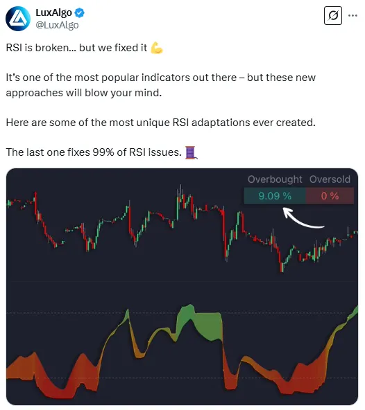
The Relative Strength Index (RSI) is a momentum oscillator ranging from 0 to 100 that helps you spot overbought or oversold conditions in a coin’s price.
Origins of RSI
RSI was developed by J. Welles Wilder in 1978 and introduced in his book New Concepts in Technical Trading Systems to address a critical gap in technical analysis: measuring momentum in a quantifiable way.
Since then, its core formula has remained unchanged, but traders have adapted it with custom settings, such as shorter periods (e.g., 7 or 9 days for faster signals) or longer periods (e.g., 21 or 50 days for smoother trends).
It has also found new applications, like crypto trading, where RSI is used alongside volume indicators to confirm breakouts, and algorithmic trading, where bots use RSI thresholds to automate buy/sell decisions in high-frequency markets.
How does it analyze crypto trends?
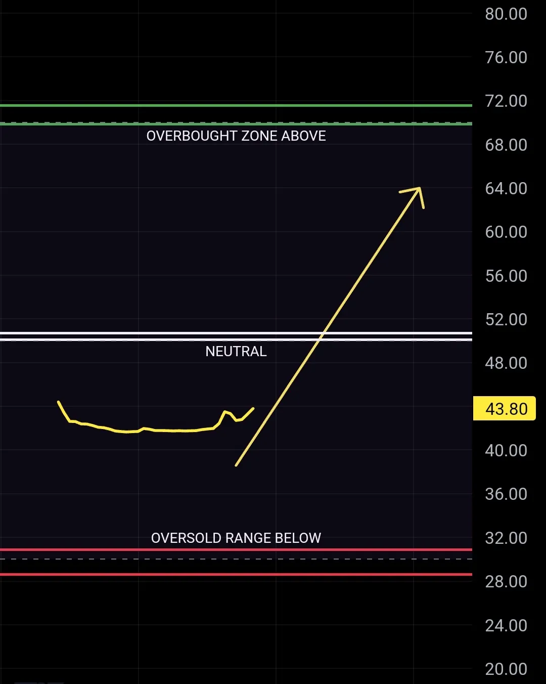
RSI measures the speed and change of price movements, essentially comparing recent gains vs. losses. This produces a value between 0 and 100 that reflects the asset’s momentum.
Overbought vs. oversold
Traditionally, an RSI above 70 suggests the asset is overbought (indicating traders have aggressively bought it, pushing the price higher than its fair value), meaning the price may have risen too fast and could be due for a pullback.
An RSI below 30 indicates oversold conditions (meaning traders have excessively sold the asset, driving its price lower than its intrinsic value), where the price may have fallen too quickly and could rebound.
Trend analysis
RSI also gives a sense of overall trend momentum by measuring whether price movements are gaining or losing strength over time.
It does so by comparing the average gains and losses over a specific period (typically 14 periods), calculating the relative strength of price changes using the following formula:
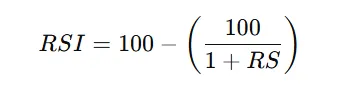
💡 RS (Relative Strength) = Average Gain / Average Loss over the selected period.
For example, if Bitcoin had 8 days of gains totaling $1,290 and 6 days of losses totaling $740, we first find the average gain ($92.14) and average loss ($52.86). Then, we calculate Relative Strength (RS) = 1.74 and apply the RSI formula: RSI = 100 - (100 / (1 + RS)), which gives RSI ≈ 63.5 (i.e., bullish momentum but not yet overbought).
When RSI stays consistently above 50, it signals bullish momentum (buyers are in control), whereas readings consistently below 50 indicate bearish momentum (sellers dominate). This midline therefore acts as a dynamic trend filter, helping gauge an uptrend or a downtrend.
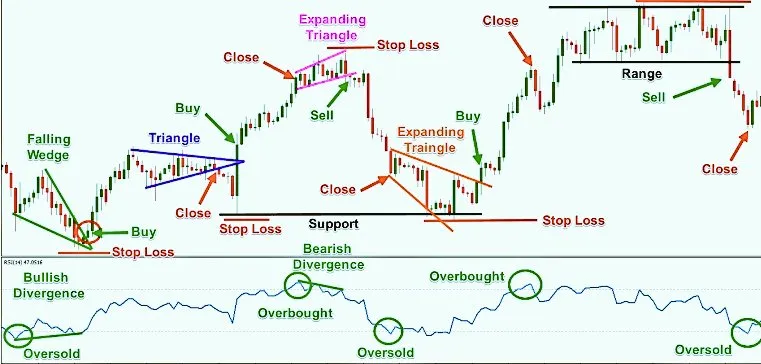
Divergences – early reversal signals
A bullish divergence occurs when the price makes a lower low but RSI makes a higher low – this “disagreement” means the downtrend’s momentum is weakening, often foreshadowing an upward reversal.
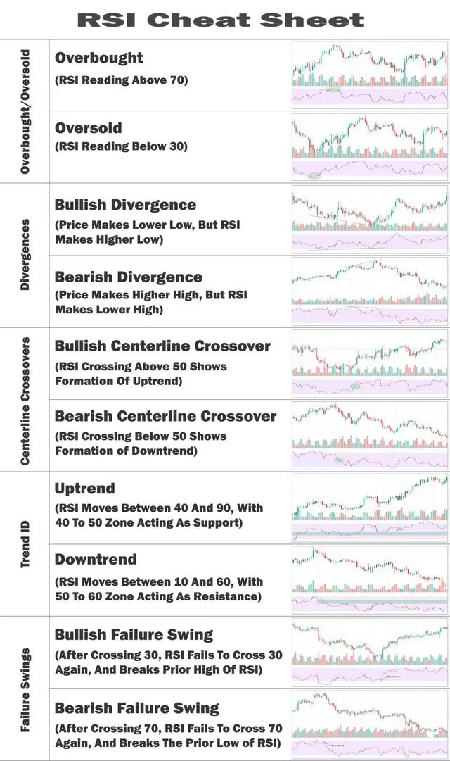
A bearish divergence is the opposite: price makes a higher high but RSI registers a lower high, signaling fading upside momentum and a possible downward reversal.
These discrepancies between RSI and price are one of the reasons RSI is so valued – it can tip off traders to slowing momentum when the price chart still looks strong or weak.
💡 Charles Schwab’s analysts note, such RSI divergences often precede reversals by indicating an “impending” shift in trend momentum.
RSI’s scalping potential and role in short-term trading
One reason RSI maintains a #1 reputation is that it’s incredibly versatile – even ultra-short-term traders (scalpers) use it because of:
Quick entry and exit signals
Scalpers favor RSI because it provides near-instant feedback on very short timeframe charts (like 1-minute or 5-minute).
When RSI flashes an overbought reading (above 70) on a 1- or 5-minute chart, a scalper may interpret that as a cue to take profits or open a short for a quick pullback. Likewise, an oversold RSI (below 30) can signal a short-term buy opportunity for a bounce.
Multiple timeframe alignment
Skilled short-term traders sometimes look at RSI across several timeframes to improve accuracy.
For example, a scalper might wait for RSI on a 1-minute and 5-minute chart both to hit oversold levels before buying, increasing confidence that a rebound is due. Some automated strategies (mean reversion bots and high-frequency trading algorithms like Sunil High-Frequency Strategy) use this multi-timeframe RSI approach to “buy the dip” on quick drops. This helps filter out false signals that might appear on one very small timeframe.
Momentum scalping
RSI is essentially measuring momentum, which is exactly what scalpers trade.
A rapid fall in RSI means momentum turned sharply bearish – a scalper could ride that wave down for a short trade. Conversely, a sudden RSI spike from low levels means bullish momentum kicked in – a cue for a quick long trade. Because crypto markets are so volatile, RSI’s real-time momentum readout is invaluable for capitalizing on tiny intraday swings.
Research-backed insights and expert opinions on RSI’s effectiveness
Experts note that RSI tends to work best in sideway or ranging markets because it helps identify reliable entry and exit points. When price is whipsawing within a range, RSI’s overbought/oversold signals are very informative (i.e., it will oscillate between high and low values), marking good turning points.
In strongly trending markets, however, RSI can stay extreme for long periods (e.g., stick above 70 in a powerful bull run), making those overbought/oversold readings less immediately actionable.
💡 This is a known limitation: in a fierce uptrend or downtrend, RSI alone might flash “overbought/oversold” too early.
For instance, during a Bitcoin bull run, RSI can remain over 70 for weeks while price keeps climbing. Hence, research suggests that RSI is most reliable when the market isn’t in a runaway trend (when prices are skyrocketing uncontrollably), but rather moving more slowly or cyclically (going up and down in a more predictable pattern).
Adjusting RSI to market conditions
Market technician Constance Brown (CMT) observed that in a strong uptrend, the “true” oversold RSI level is often higher than 30 (because the indicator seldom falls that low). Similarly, in a downtrend, RSI might rarely reach 70 – so an “overbought” condition might actually be around 60.
Therefore, traders do sometimes raise the oversold threshold (to 40, for example) during bull markets, or lower the overbought threshold (to 60) during bear markets.
💡 Expert tip: By adapting RSI levels to the overall trend, you can get more accurate signals. Wilder himself (the creator of RSI) noted the importance of interpreting RSI in context, and many professionals fine-tune RSI settings (period length or threshold levels) to suit the asset’s behavior.
Divergences and confirmation
The inventor, J. Welles Wilder, and many traditional chartists (such as Andrew Cardwell) consider RSI divergences a very strong signal of pending reversals. However, some quantitative analysts (like Timothy Sykes) point out that divergences can be tricky – they’re easier to spot in hindsight and don’t always guarantee a reversal unless confirmed by price action.
In other words, a divergence is a heads-up, but traders might wait for the price to actually break support/resistance or for a pattern to complete before acting. This nuanced view is backed by backtesting results that show divergence alone isn’t a surefire trigger, but it’s certainly a valuable alert.
Backtested performance
Numerous backtests have been done on RSI strategies. For instance, a backtest on the S&P 500 ETF (SPY) using a 2-day RSI strategy—buying when the RSI drops below 15 and selling when it exceeds 85—showed a win rate of approximately 91%.
This demonstrates RSI’s power in identifying when price has stretched too far and is likely to mean-revert. In crypto, due to higher volatility, results will vary, but traders have reported success using modified RSI strategies (e.g., RSI[2] for short-term bounces).
Combine with other indicators
Almost every expert agrees: you shouldn’t use RSI in isolation for critical decisions. While RSI is powerful, it can produce the occasional false signal (like any indicator). The good news is many of those can be filtered out by adding a confirming indicator or condition.
Using RSI along with other tools like MACD, Stochastics, or simple trendlines helps filter out bad signals and makes trading decisions more reliable. Research supports this – traders who check RSI against other evidence (volume, trend, chart patterns) tend to have better results than those who trade off RSI alone.
Best channel to follow for RSI and crypto trading
One highly recommended resource is Krown’s Crypto Cave on YouTube. He often discusses how to interpret RSI signals (including hidden divergences, RSI ranges, etc.) in real time, making his channel a great learning tool for RSI-focused trading. Krown even developed custom RSI indicators (like the Krown RSI + EMA template) to help identify trend “control zones” (i.e., specific RSI levels, like 40-60).
Some Telegram groups run by veteran traders (like Trade With Trend - Raunak) also post RSI-based trade setups (just be sure to choose reputable communities). However, YouTube channels tend to provide more in-depth tutorials on RSI. Apart from Krown’s Crypto Cave, other popular crypto TA channels like The Chart Guys, Crypto Cred, or Benjamin Cowen occasionally offer valuable lessons on RSI and momentum trading.
💡 Tip: Look for channels that do live analysis – seeing analysts apply RSI in live market conditions can teach you how to react to indicator changes. Also, any channel or group that emphasizes risk management and confirms RSI signals with price action will likely help you grow as a trader.
Final trading advice for RSI
RSI is most powerful when you align its signals with the market’s trend direction.
For example, if the market is in an uptrend, focus on RSI’s oversold signals (dips below 30 or 40) as potential buying opportunities in the direction of the trend, rather than shorting every time RSI goes above 70. In a downtrend, do the opposite – give more weight to RSI overbought readings for possible sell/short entries. By trading in sync with the larger trend, you filter out many false signals and improve your odds of success.
Additionally, always confirm RSI signals. This could mean waiting for the price to break a support/resistance level or using another indicator (like MACD or volume spikes) to validate what RSI is telling you.
For instance, an RSI divergence is more convincing if you also see a candlestick reversal pattern at the same time. And remember to adjust your RSI strategy to the timeframe and coin you’re trading – maybe use a shorter RSI period for very volatile altcoins or tweak the overbought/oversold thresholds as discussed earlier.
Moving Average Convergence Divergence (MACD)
The Moving Average Convergence Divergence (MACD) shows the relationship between two moving averages of price, helping you see the direction and strength of a cryptocurrency’s trend.
Origins of MACD
The Moving Average Convergence Divergence (MACD) indicator was developed by Gerald Appel in the late 1970s for traditional stock trading (i.e., equity and commodities markets to spot trend changes and momentum shifts). As crypto markets emerged in the 2010s, traders adopted MACD to navigate high volatility and rapid price swings.
What is MACD and how it helps analyze crypto trends?
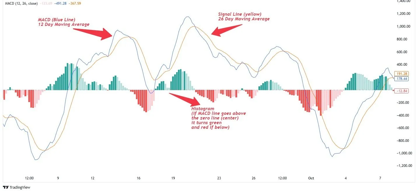
MACD consists of two lines and a histogram that oscillate around a zero line on a chart:
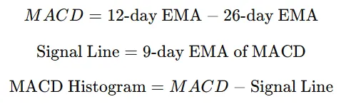
- MACD Line: The difference between a shorter-term and longer-term exponential moving average (EMA) of price (commonly 12-day EMA minus 26-day EMA). This line reacts to changes in price momentum.
- Signal Line: An EMA (usually 9-day) of the MACD line. This is a smoothed version of the MACD line, acting as a trigger for buy/sell signals.
- Histogram: The bar chart that visualizes the gap between the MACD line and the signal line. Growing bars mean the two lines are diverging (momentum is strengthening), while shrinking bars mean they are converging (momentum is weakening).
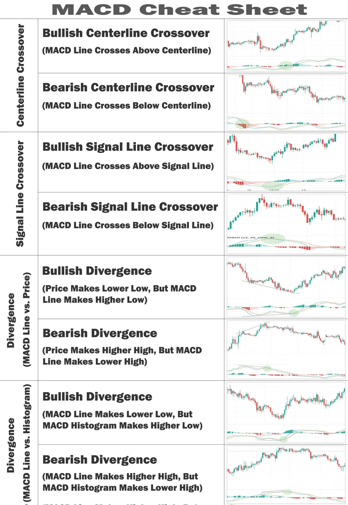
Key MACD signals include:
Signal-line crossover
When the MACD line crosses above the signal line, it’s a bullish signal (indicating upward momentum); crossing below is bearish. Traders often interpret an upward crossover as a hint to buy, and a downward crossover as a cue to sell (or go short).
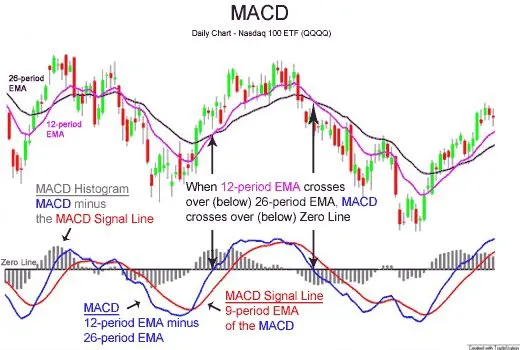
Zero-line crossover
When the MACD line crosses above zero, it confirms bullish trend momentum; below zero signals bearish momentum. Crossing the zero line reflects a shift in the trend’s baseline (e.g. MACD above zero means the short-term average has moved above the long-term average, a sign of an emerging uptrend).
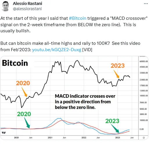
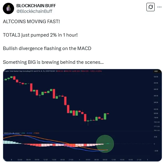
Divergence
This occurs when the price and the MACD indicator move in opposite directions. For example, if price is making new highs but the MACD line is making lower highs (bearish divergence), it suggests the uptrend is weakening and might reverse downward. Conversely, if price makes a lower low but MACD forms a higher low (bullish divergence), it signals a downtrend losing steam and a possible upward reversal.
MACD in short-term trading and scalping
Despite being a lagging indicator (since it’s derived from moving averages), MACD can be adapted for short-term trading and scalping. Many intraday traders tweak the MACD’s settings to make it more sensitive, for example by using shorter-period EMAs, so that it reacts faster to price moves. This faster MACD will generate more frequent signals, which is ideal for scalpers aiming to profit from small price fluctuations.
In scalping, traders look for quick hints of momentum change:
- Rapid MACD line crossovers (up or down) on a short timeframe chart can signal an entry or exit opportunity within minutes.
- Changes in the histogram’s size are closely watched – a widening histogram indicates increasing momentum in the current direction, while a shrinking histogram suggests a trend is stalling. For example, if a coin’s price is climbing and the MACD histogram bars start shortening, a scalper might take profit before the broader market notices the momentum fading.
- Even mini-divergences on very short timeframes can be useful. If price makes a new low on the 1-minute chart but MACD doesn’t, a scalper might anticipate a quick bounce.
That said, traders usually combine MACD with other confirmation tools (like RSI, which identifies overbought/oversold conditions; Bollinger Bands, which measure volatility and price extremes; or volume indicators, which confirm the strength of a trend by analyzing buying and selling activity) even in scalping.
Does MACD indicate support and resistance levels?
In summary, MACD doesn’t identify support or resistance on its own – you’ll need to rely on price charts for that. It’s common practice to map out key S/R levels on the chart, then use MACD’s momentum cues to decide if a break of resistance or hold of support has credible strength. Think of MACD as complementary to support/resistance analysis: it adds insight about the force behind a move, but you’ll still draw your lines and zones based on price history.
Effectiveness of MACD: Research and expert insights
Analysts note that MACD is “one of the best indicators for identifying trends and reversals” in financial markets. Its ability to signal a bullish or bearish turn (through crossovers or divergences) before or as it happens on the price chart makes it invaluable for timing entries and exits.
Furthermore, MACD’s histogram offers a quick visual gauge of momentum, helping traders judge the strength of a trend at a glance. This has led experts to use MACD not just for entry signals, but also to confirm market sentiment (e.g., staying in a trade as long as MACD histogram bars grow, then cautioning when they shrink).
Research-backed insights
Studies of trading performance with MACD provide a nuanced view of its effectiveness. Academic backtesting suggests that MACD works best as part of a broader strategy rather than a stand-alone signal generator.
For instance, one study found that a strategy using only the classic MACD (12,26,9 settings) for entries had a win rate of under 50%. However, when MACD signals were combined with other indicators like the Relative Strength Index (RSI) or Money Flow Index, the win-rate improved significantly.
This notion aligns with what many experts say anecdotally: MACD is powerful, but you increase its accuracy and reduce false signals by confirming with another indicator or two. In fact, MACD’s own inventor, Gerald Appel, often suggested using additional filters for confirmation.
It’s also noted that MACD can struggle in sideways (range-bound) markets, where price whipsaws cause the MACD lines to crisscross frequently. In such conditions, MACD might flash multiple buy/sell signals that don’t amount to meaningful moves.
Therefore, traders are advised to be cautious when the market lacks a clear trend; during those times, MACD signals might need extra confirmation (or one might avoid trading choppy markets altogether).
Best channels for MACD and crypto trading insights
One highly recommended resource is The Chart Guys on YouTube. The Chart Guys provide daily technical analysis on cryptocurrencies and often explain their use of indicators (including MACD) during live chart breakdowns.
On Telegram, you can find crypto trading groups that discuss strategies and even share trading signals based on MACD, like Crypto Inner Circle and Wolf of Trading.
🚨 Exercise caution with signal groups – not all are reliable, and it’s easy to become dependent on alerts without understanding them. It’s usually better to use such channels as a learning tool (to see how others apply MACD) rather than blindly following trades.
Other notable mentions include traders like Philakone (known in the crypto community for technical analysis) who share insights on social media, and many free resources on TradingView where users publish charts with MACD analysis.
Final trading tip for MACD
A golden rule with MACD (and any indicator) is not to use its signals in isolation. While MACD can strongly indicate a momentum shift or trend reversal, confirming those signals with other evidence will greatly improve your success rate. Remember that MACD, being derived from past prices, can give false signals in sideways markets or during brief price spikes. So, incorporate simple checks: Is the market trending or ranging? What are other indicators (like RSI or moving averages) saying?
💡 For example, if you get a bullish MACD crossover, check if volume is rising or if the price has broken a resistance level in tandem (i.e., add confidence that the move is real).
Also, MACD’s default settings (12, 26, 9) work well for many scenarios, but they aren’t sacrosanct. If you find MACD is reacting too slowly (giving late signals) for the timeframe you trade, consider experimenting with shorter EMAs to speed it up. Conversely, if you’re getting whipsawed by too many signals, a slightly longer setting or applying a longer timeframe might help.
The key is to backtest any adjustments on historical data from the crypto you trade – see how those MACD settings would have signaled past trends or reversals, and whether that would improve your entries/exits.
Exponential Moving Average (EMA)
The Exponential Moving Average (EMA) is a type of moving average that places greater weight on recent price data, making it more responsive to current market conditions.
Origins of EMA
In the 1950s, Charles C. Holt introduced methods for exponential smoothing, which laid the groundwork for the EMA. Holt's work was further extended by his student, Peter Winters, leading to the development of the Holt-Winters method for forecasting.
In the realm of technical analysis, P.N. (Pete) Haurlan, a rocket scientist affiliated with the Jet Propulsion Laboratory (JPL) in the early 1960s, was among the first to apply exponential smoothing techniques to track stock prices. He referred to these smoothed values as “Trend Values,” using specific smoothing constants. For instance, what is commonly known today as a 19-day EMA, he termed a “10% Trend.”
How EMA works
The EMA is calculated by applying a higher weighting (via a multiplier) to more recent prices:
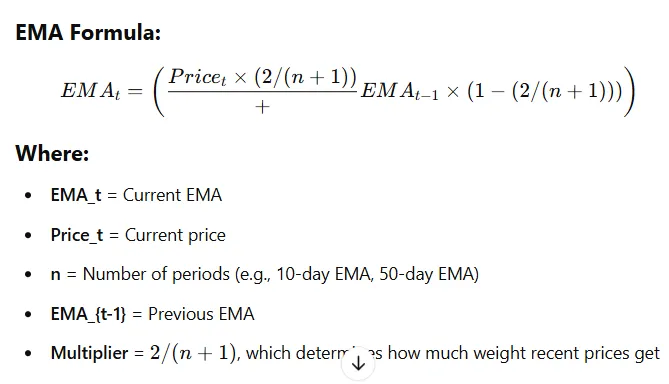
First, you choose a time period (e.g., 10-day EMA). Then, a multiplier is used to decide how much weight to give the newest price compared to older prices (calculated as 2 divided by the selected period + 1). The formula starts with a Simple Moving Average (SMA) for the first value, and after that, each new EMA is found by taking the previous EMA, adding a portion of the newest price, and adjusting it with the multiplier.
How does EMA help analyze crypto trends?
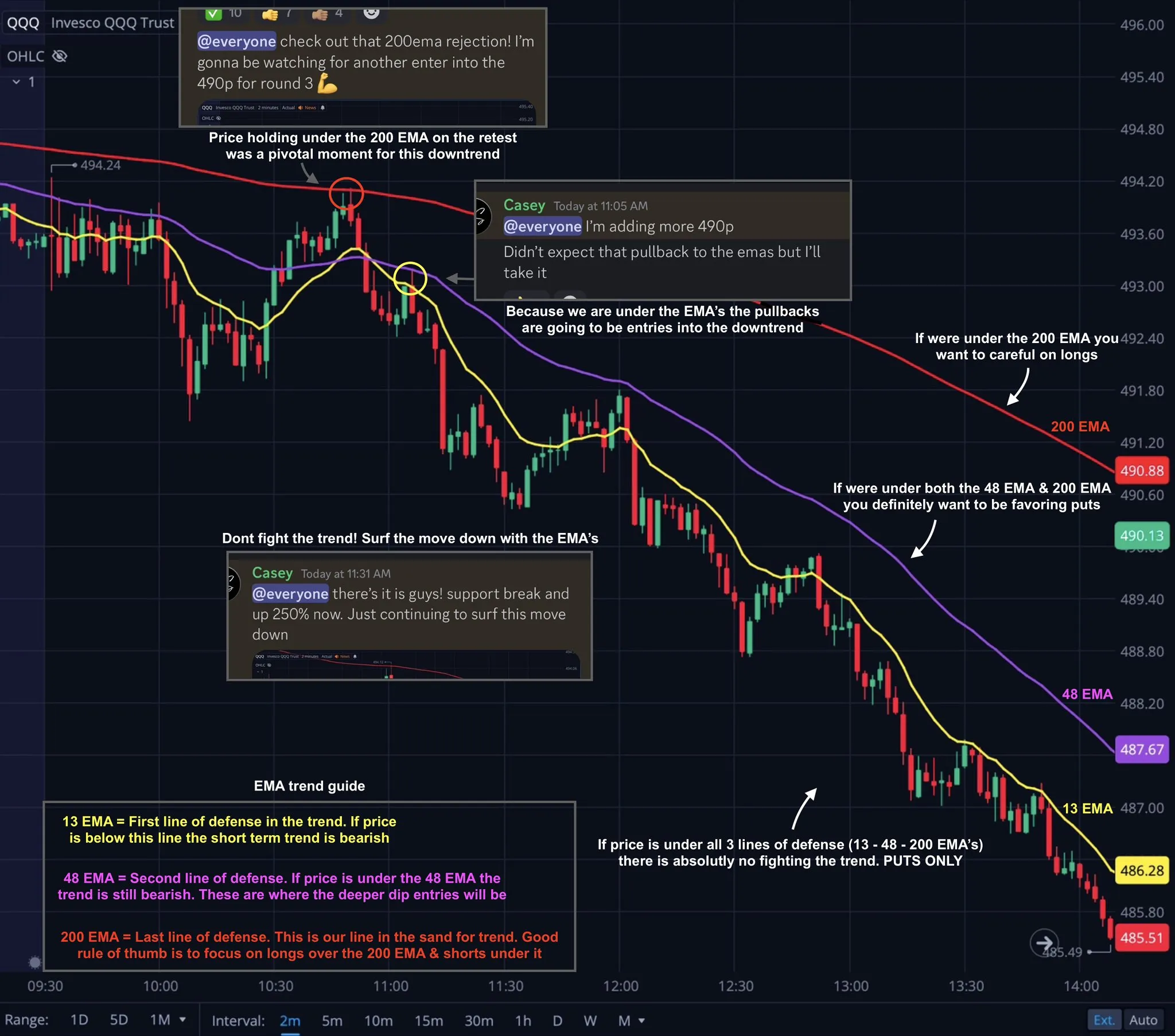
Traders commonly use moving averages like the EMA to identify trend direction – if price stays above the EMA, the market is generally in an uptrend (bullish), whereas price below the EMA signifies a downtrend (bearish).
For example, the slope and position of the EMA indicate momentum: a rising EMA line below the price reflects bullish momentum (buyers in control), whereas a falling EMA above the price signals bearish momentum (sellers in control).
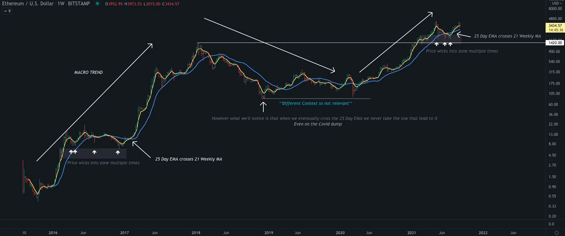
Traders also watch for EMA crossover signals as clues of trend reversal. When a short-term EMA crosses above a long-term EMA, it’s a bullish signal suggesting an emerging uptrend (often called a “golden cross”); conversely, a short EMA crossing below a long EMA is a bearish signal (a “death cross”) indicating a possible downtrend
Even a single EMA can hint at reversals: if the price has been below an EMA and then breaks above it, that breach can mark a bullish trend change – especially on key periods like the 50-day or 200-day EMA which many traders track.
💡 EMAs tend to respond so quickly that in one analysis (presented by Kevin Wong) the 20-day EMA turned upward before the equivalent SMA when a downtrend flipped to an uptrend, alerting traders to the new uptrend sooner.
Scalping potential and short-term trading with EMA
On one-minute or five-minute charts, EMAs can update almost immediately with the latest price swings, giving scalpers an edge in timing entries and exits.
For example, a scalper might use a very short-period EMA (like a 9 or 20 EMA) to track immediate price direction – when price ticks above the EMA, they might quickly go long for a few points, and flip short when price drops below. Such tactics are feasible because the EMA’s fast reaction captures momentum shifts in real time, allowing traders to capitalize on even small intraday trend changes.
Keep in mind, while the EMA’s sensitivity is great for fast markets, it also means one must be quick and disciplined – scalpers typically combine EMAs with tight stop-losses, since the same rapid moves that create opportunities can also reverse just as fast.
Does EMA indicate support and resistance levels?
Yes – many traders use EMAs as dynamic support and resistance levels on their charts. In an uptrend, a key EMA (say the 50-day or 200-day EMA) often acts as a support line that price pulls back to but then “bounces” off, as buyers step in at that average price level. Likewise, in a downtrend, an EMA above the price can serve as a resistance barrier that caps rallies, as sellers sell near the EMA line.
These moving average support/resistance levels are not fixed like traditional horizontal lines; instead, they move along with price, adapting to the trend’s trajectory (hence “dynamic” support/resistance).
For instance, Bitcoin traders frequently watch the 200-day EMA – if BTC’s price is climbing and then dips, the 200-day EMA is a common area where it might find support and resume its rise. On the flip side, if price is below the EMA, that EMA often behaves as an overhead resistance where rallies stall out.
The EMA basically creates a trend-following floor or ceiling: as long as the trend stays intact, price tends to respect the EMA.
💡 Technical analysis guides note that prices often revert to the mean represented by a moving average during trends, so an EMA line can be a reliable reference for where pullbacks might end or breakouts could face pushback.
Research-backed insights and expert opinions on EMA effectiveness
One quantitative analysis reported that comparing the market price to a mid-range EMA (around the 50-day EMA) yielded the highest risk-adjusted returns among moving-average strategies. In other words, using the 50-day EMA as a trend filter or signal gave better risk/reward outcomes than many other common indicators. These include the 200-day Moving Average (which reacts slower to price changes), the 5-day EMA (which can generate too many false signals), and the Relative Strength Index (RSI).
Additionally, research by market analysts highlights how EMAs capture trend changes earlier than simple averages. For example, Oanda’s market analysis showed the 20-day EMA turning upward ahead of the 20-day SMA when a new uptrend started, underscoring the EMA’s early signaling advantage.
Expert opinions
Brett Sifling, an investment advisor at Gerber Kawasaki, says he prefers using an EMA for shorter-term signals (like the 50-day) because it provides “a more sensitive signal during times of volatility.”
Experts also note that the EMA works best in trending markets – its fast reaction can generate false signals in choppy, sideways markets, but when a clear uptrend or downtrend is present, the EMA excels at keeping traders in the move.
Recommended channel for EMA and crypto trading strategies
One highly regarded resource is “The Moving Average” channel on YouTube, which offers day trading tutorials focused on practical use of indicators like EMAs in crypto and forex markets. Traders on forums have noted that The Moving Average provides quality content without excessive hype – the channel is informative and even offers courses, yet the creator isn’t overly pushy about selling them.
If you prefer Telegram or community interaction, you might also look into technical analysis groups (many crypto trading Telegram channels discuss EMA setups), but be selective – ensure the group is led by experienced traders and focuses on learning rather than just signals.
Final trading tip: Optimizing your strategy with EMA
While the EMA is a powerful indicator, remember that no single tool guarantees success. To optimize your trading strategy, use the EMA in conjunction with other indicators or analysis for confirmation.
For example, many traders pair EMA cues with an oscillator like RSI or a secondary indicator like MACD – if both the EMA trend and the RSI momentum agree, a signal is more credible.
Research suggests that combining EMA with other technical indicators can improve the performance of trend-following strategies.
This means if price crosses above your EMA and at the same time RSI is showing strength (or MACD has a bullish crossover), the confluence increases the probability of a successful trade. Additionally, consider using multiple EMAs (such as an EMA “ribbon” or dual EMAs) to gauge trend strength;
💡 For instance, a wider gap between a short-term and long-term EMA indicates a stronger trend, whereas a narrowing gap could warn of a weakening trend.
Always apply good risk management – set stop-loss levels and position sizes appropriately – because even the best EMA signal can fail in practice. In volatile crypto markets, don’t rely on the EMA alone; use price action cues (like support/resistance or candlestick patterns) alongside it.
“Remember the risks so you don’t bet the family farm on one indicator.” CoinDesk
Bollinger Bands
Bollinger Bands are a technical analysis indicator used to measure market volatility and identify potential buy or sell opportunities.
Origins of Bollinger Bands
Bollinger Bands were developed by John Bollinger, a financial analyst and trader, in the 1980s as a tool to measure market volatility and identify overbought or oversold conditions.
Bollinger created this indicator while working in technical analysis and market research, aiming to improve upon traditional moving average envelopes, which used fixed percentage bands. He introduced the concept of dynamic bands that adjust based on market volatility, making them more adaptable to different market conditions.
What are Bollinger Bands?
Bollinger Bands consist of three lines:
1. Middle Band – A Simple Moving Average (SMA), usually set to 20 periods, which represents the average price over time.

2. Upper Band – Positioned two standard deviations above the SMA, showing the higher range of price movement.
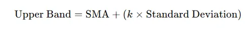
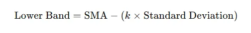
3. Lower Band – Positioned two standard deviations below the SMA, showing the lower range of price movement
How Bollinger Bands work (trend reversals & volatility shifts)
When price volatility drops, the bands tighten (move closer together), and when volatility surges, the bands widen. Periods of extreme band compression (a “squeeze”) indicate a tight trading range and often precede a major move; in other words, low volatility builds up pressure that typically precedes an expansion (a big breakout or breakdown). Traders watch for these squeezes as early warnings of a volatility shift.
Trend reversals
Bollinger Bands also offer clues for potential trend reversals. By definition, price hitting the upper band is relatively “high” and price at the lower band is relatively “low”. A common contrarian approach is to look for overextended moves beyond the bands as signals of exhaustion.
For example, when price penetrates below the lower band, it may indicate an oversold market and a potential upside reversal; conversely, a push above the upper band can imply an overbought market due for a pullback.
In practice, traders often wait for the price to move back inside the bands as confirmation of the reversal. These characteristics make Bollinger Bands effective for spotting possible turning points and momentum shifts.
💡 Note: During strong trends, price can ride along the band for a while, so not every band touch means a reversal.
Scalping potential and short-term trading
On very short time frames, the bands can highlight rapid price extremes and quick mean-reversion opportunities.
Scalpers often use Bollinger Bands to time entries and exits for fast trades. For instance, if price spikes and “tags” an upper band on a 1–5 minute chart, that sudden band penetration often suggests the move is overextended and likely to slow or reverse, so a scalper might take profits (or even initiate a counter-trend trade) at that point .
Likewise, a dip to the lower band in a short-term down-move can hint that selling momentum is exhausted. In fast markets, traders combine Bollinger Bands with other quick indicators (like Stochastic or RSI) to confirm these micro overbought/oversold signals.
Bollinger Bands’ adaptability also means traders can tweak the settings for scalping – for example, using a wider band (3 standard deviations) to reduce false signals, or overlaying multiple sets of bands – to suit the high speed of crypto markets. Overall, their responsiveness and clear visual cues make Bollinger Bands a handy tool for scalping strategies and rapid trade decisions.
Bollinger bands as dynamic support and resistance
Because roughly 95% of recent price action is contained within the bands (with default settings), the upper band tends to behave like a resistance ceiling and the lower band like a support floor. In practice, this means rallies often stall near the upper band and pullbacks often find support near the lower band, as price is hitting an extreme of its typical range. The middle band (the moving average) can also flip roles depending on price location: if prices are above the middle band, that line serves as a support baseline, and if prices are below it, the middle band acts as a resistance barrier
Lower 50-period band on a 1-minute chart (1 standard deviation) provides good support for ES during the 'am reversal' time around 10am (ET). Source: X
Traders use these properties in planning trades – for example, setting profit targets at the upper band during an uptrend (since that’s where upward moves often run out of steam), or buying near the lower band in range-bound conditions expecting a bounce (sometimes called a “Bollinger bounce”).
Effectiveness: Research-backed insights and expert opinions
Many veteran traders swear by them – for example, one crypto trading guide calls Bollinger Bands “one of the most trusted indicators” for assessing trend momentum and volatility.
This high regard isn’t just anecdotal; it’s supported by research. A 2024 study examining crypto trading strategies selected Bollinger Bands over other indicators, citing their unique advantage of dynamically adapting to market volatility and providing a robust framework for spotting potential price reversals.
The researchers noted that Bollinger Bands’ flexibility and proven performance made them a “superior choice compared to static trading rules,” especially in the fast-changing crypto environment.
Experts also emphasize that Bollinger Bands are multifaceted – they encapsulate trend, volatility, and relative price level all at once. This means traders can interpret a lot from a single indicator (trend direction, strength, and possible turning points) rather than juggling many separate tools. However, seasoned analysts do advise using Bollinger Bands as part of a broader strategy.
Best channel to follow for Bollinger Bands & crypto trading
To learn more and see Bollinger Bands in action, one of the best resources is John Bollinger’s official YouTube channel, aptly named “Bollinger Bands.” Channels like MoneyZG and Crypto Jebb often incorporate Bollinger Bands into their Bitcoin and altcoin analysis, explaining setups like band squeezes or breakouts.
If you prefer Telegram communities, look for a reputable crypto trading group focused on technical analysis – some groups share Bollinger Band signals or analysis (just ensure any group you join has a good track record).
Final tip: Optimizing your trading strategy with Bollinger Bands
Bollinger Bands excel at highlighting price extremes and volatility changes, but a band “tag” by itself is not a guaranteed signal. In fact, John Bollinger himself stresses that touching the upper band is not automatically a sell signal (nor is touching the lower band a buy) – in strong trends, prices can “walk up” the upper band or down the lower band for an extended time.
To optimize your strategy, wait for confirmation of Bollinger Band signals. For example, if price pierces the upper band, you might confirm an entry/exit by checking an oscillator like RSI for overbought conditions or looking for a candlestick reversal pattern.
Simple Moving Average (SMA)
The Simple Moving Average (SMA) is a fundamental technical indicator that calculates the average price of an asset over a specified period, using each period’s price (often the closing price) with equal weight.
Origins of SMA
While no single person is credited with its invention, moving averages were first used by economists and statisticians to smooth out time-series data in financial markets, helping identify long-term trends.
In the 1930s and 1940s, analysts in stock and commodity trading began applying SMA to price data to track trends and reduce short-term noise. As markets became more sophisticated, SMA became a key tool for technical analysts in identifying trend directions, support and resistance levels, and potential trading signals.
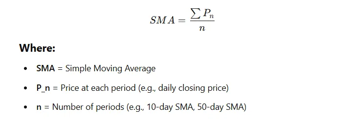
Formula for SMA?
By smoothing out short-term price fluctuations (market “noise”), the SMA highlights the underlying trend direction in a cryptocurrency’s price.
The formula for Simple Moving Average is:
For a 5-day SMA, if the closing prices for the last 5 days are: $100, $102, $104, $98, and $101, the SMA would be:
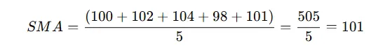
This means the 5-day SMA is $101, smoothing out short-term fluctuations to show the trend direction.
How SMA works: Analyzing trends, reversals, and momentum shifts
As a trend-following tool, the SMA moves slowly with price, acting as a lagging indicator that confirms trends rather than predicting new ones.
Traders often watch how the price interacts with the SMA line (or how two SMA lines interact with each other) to infer momentum shifts and possible trend reversals.
For example:
Price vs. SMA
When price stays above a rising SMA, it signals an ongoing uptrend (bullish momentum). If price drops below the SMA, it may indicate a weakening uptrend or start of a downtrend.
A significant move below a long-term SMA is commonly interpreted as a trend change to the downside. Similarly, a climb back above the SMA suggests bullish momentum returning.
SMA crossovers
Using two SMAs of different periods can provide clear reversal signals. If a short-term SMA (e.g. 13-day) crosses above a longer-term SMA (e.g. 26-day), it’s a classic bullish signal – the short-term trend is gaining momentum upward. Conversely, a 13-day SMA crossing below the 26-day SMA signals that the trend is flipping bearish, indicating a good time to sell.
These “golden cross” or “death cross” patterns are effective at identifying when momentum shifts occur and a trend reversal may be underway.
Scalping and short-term trading with SMA
Scalpers often use very short-period SMAs (such as 5, 8, or 13-period SMAs) on low-timeframe charts (1 to 5 minute intervals). When plotted together, these create a moving average ribbon that vividly shows the immediate trend.
For instance, placing a 5-8-13 SMA combination on a 2-minute chart can help identify strong micro-trends that are ideal for scalping. If all three SMAs are aligned and sloping upward, price tends to stay above the short SMAs, confirming a strong uptrend where quick buy trades can be made.
This method also provides early warnings of momentum shifts intraday. When the price pierces below the longer SMA in the ribbon (e.g., drops under the 13-period SMA), it signals waning momentum and a likely pause or reversal in the trend. A scalper seeing this might take profit or avoid new long positions because the up-move is losing steam. In the same way, if prices were falling and then push above a short-term SMA, it hints that bearish momentum is fading.
Because SMAs respond quickly on short periods, traders can scalp by entering on minor pullbacks during a strong trend (when price touches an SMA and then bounces). The simplicity of the SMA’s signals – price above or below a line – makes split-second decision-making easier for high-speed trading.
SMA as a support and resistance indicator
Traders worldwide watch certain key moving averages, and their collective actions can make these lines self-fulfilling prophecies where price tends to react:
Major SMAs (50, 100, 200)
The 50-day, 100-day, and 200-day SMA are among the most commonly drawn indicators on trading charts. These are considered significant levels where the SMA line itself can halt a price move or initiate one.
For example, the 50-day SMA is frequently regarded as the first line of support during an uptrend and the first line of resistance during a downtrend.
If Bitcoin’s price is in an uptrend and then pulls back, traders expect it might “bounce” when it touches the rising 50-day SMA, because many will buy at that level – effectively turning the SMA into a support floor. Likewise, in a downtrend, a rally up to the falling 50-day SMA often meets selling pressure, making the SMA a resistance ceiling where the price could turn back down.
Self-reinforcing effect
Because so many market participants pay attention to these moving average levels, they often become psychological support/resistance zones. A classic example is the 200-day SMA, widely viewed as a long-term barometer of market health. When prices are above the 200-day, the market is considered bullish; if prices drop below it, it’s often seen as a bearish sign. Traders might place buy orders around the 200-day SMA in expectation it will hold as support, or set stop-losses if price falls through it. This behavior can cause the price to respect the SMA line multiple times.
Effectiveness and expert insights on SMA
Historical market analysis backs the SMA’s value. For example, studies of price behavior show that the 50-day SMA in particular is a highly effective trend indicator. Traders have observed that as long as an asset’s price remains above its 50-day average, the uptrend is intact – and this has held true often enough to make the 50-day SMA a staple in trend analysis.
Widely used by traders
Many experts consider moving averages to be the single most important technical indicator, since they form the basis of several other tools (the MACD momentum indicator uses moving average calculations, and Bollinger Bands include a moving average as the central line).
Research-backed performance
Recent studies of cryptocurrency markets have found that trading rules based on moving averages can lead to favorable outcomes, outperforming random chance. In the study "Moving Averages Trading Method Applied to Cryptocurrencies," researchers analyzed the performance of Moving Average (MA) strategies across the 40 largest cryptocurrencies by market capitalization, comparing them to a buy-and-hold approach. The findings revealed that for certain cryptocurrencies, the MA strategy outperformed the buy-and-hold method.
Best resource to learn SMA strategies (YouTube/Telegram)
For those seeking to deepen their understanding of Simple Moving Average (SMA) strategies in crypto trading, here are some additional resources beyond the previously mentioned:
YouTube channels
MoneyZG: This channel offers a variety of tutorials on cryptocurrency trading strategies, including those utilizing moving averages. The content is designed to be accessible for both beginners and experienced traders.
Crypto Sniper: Hosted by Sheldon the Sniper, this channel provides in-depth tutorials on trading cryptocurrencies using various strategies, including moving averages.
Telegram channels
Fat Pig Signals: This group helps traders understand how to apply SMA strategies effectively.
CoinCodeCap Signals: This channel offers market analysis, and caters to both beginners and experienced traders.
Final trading tip: Optimizing your strategy with SMA
Because the SMA is a lagging indicator, it’s wise to combine SMA signals with other indicators or price-action cues to avoid false signals. For example, if an SMA suggests a trend reversal (price crossing below a key SMA), you might check the Relative Strength Index (RSI) for weakness or look for a confirming chart pattern before acting. This multi-confirmation approach can filter out situations where the SMA briefly whipsaws due to temporary volatility.
Also, choose the right SMA period for your goals: a 200-day SMA works well for long-term investors to identify macro trends, while a 20-day or 10-day SMA is better suited for short-term traders or scalpers seeking quicker signals. You can even use multiple SMAs (short + long) to get a fuller picture of trend stages. Finally, remember to adjust your strategy to market conditions – in a strongly trending market, the SMA will be more reliable (price will respect the SMA line), whereas in a choppy, sideways market, the SMA may give mixed signals. In those cases, be more cautious or pair the SMA with a volatility indicator.
The Golden Ratio
The Golden Ratio Indicator is often hailed as one of the best technical indicators in crypto trading due to its unique blend of mathematical significance and practical utility.
Origins of the Golden Ratio?
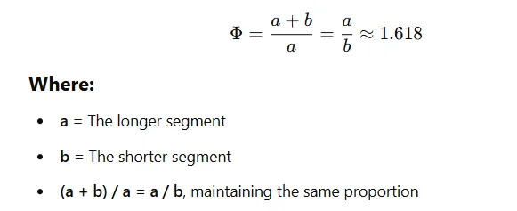
The Golden Ratio, often denoted as Φ (Phi) ≈ 1.618, has fascinated mathematicians, artists, and scientists for centuries. Its origins trace back to ancient Greece, where it was first studied by Euclid in his mathematical work Elements (~300 BCE). He described it as the "extreme and mean ratio," defining how a line could be divided into two parts such that the whole length divided by the longer segment is equal to the longer segment divided by the shorter one.

Later, in the 13th century, Leonardo Fibonacci indirectly popularized the ratio through the Fibonacci sequence (1, 1, 2, 3, 5, 8, 13…), where the ratio between consecutive numbers approaches 1.618. This connection made the Golden Ratio significant in nature, art, and architecture, appearing in spiral galaxies, shells, the Parthenon, and even human anatomy.
During the Renaissance, artists like Leonardo da Vinci incorporated the Golden Ratio into their works, such as in Vitruvian Man and The Last Supper, believing it created visually pleasing proportions. In modern times, the Golden Ratio is used in finance, design, and algorithmic trading, influencing strategies such as Fibonacci retracements in technical analysis.
Golden Ratio formula?
The Golden Ratio (Φ) is defined mathematically as:
How the Golden Ratio works in crypto: Identifying key support and resistance
Crypto traders utilize these levels to plot price points where an asset is likely to stall or reverse. In essence, the indicator adds Fibonacci-based lines to a chart – often at 61.8%, 38.2%, etc. of a prior price move – which serve as guideposts for support and resistance. By doing so, it provides a clearer picture of the trend’s structure and potential turning points amid crypto’s volatile swings.
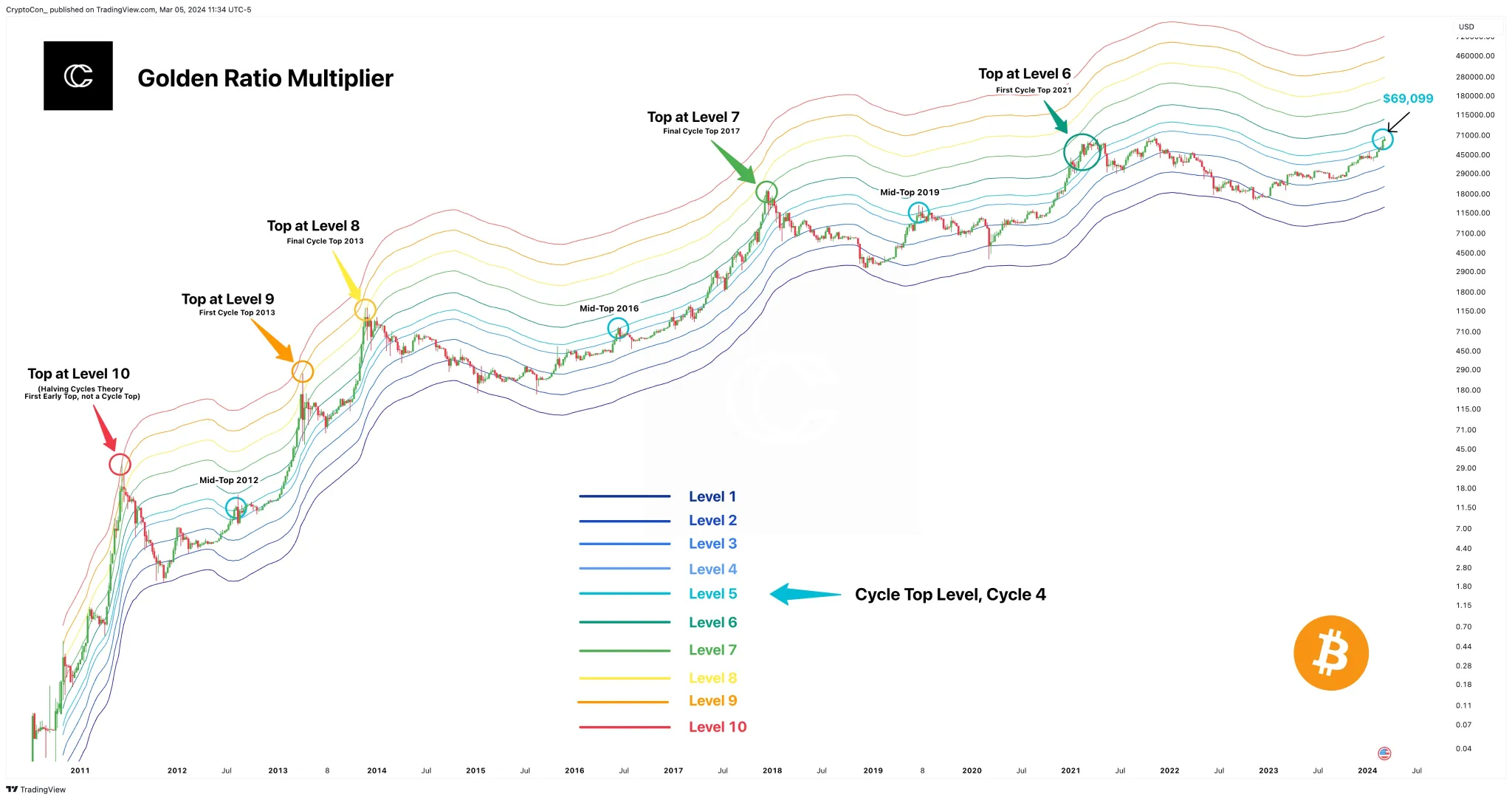
These specific retracement levels often pinpoint where the price might find support or resistance – for example, a rally may pull back around 61.8% of its gain before continuing upward. Another approach is seen in the Golden Ratio Multiplier indicator, which multiplies a long-term moving average (for Bitcoin, the 350-day MA) by the golden ratio (1.6) and its related multiples (such as 0.618 or 2.0) to project major price ceilings and floor.
%20is%20no.webp)
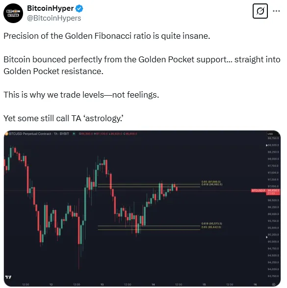
In both cases, the golden ratio-based lines highlight high-probability zones where the asset’s price has reacted before, effectively mapping out where buyers or sellers are likely to emerge. Notably, these Fibonacci levels tend to align with market psychology – many traders are watching the same 61.8% retracement or 1.618× extension, making those levels self-reinforcing as support or resistance.
Scalping potential and short-term crypto trading
Market movements are fractal, meaning Fibonacci patterns repeat on all time scales. A scalper might draw Fibonacci retracement lines on a 5-minute Bitcoin chart after a quick surge, then look for the price to bounce at the 61.8% pullback level for a quick long trade.
In fact, many trading platforms offer automatic golden ratio tools that work on any timeframe – they will plot multiple intraday support and resistance lines based on the golden ratio, giving scalpers a roadmap for the current session’s price range.
Because these Fibonacci-based levels adjust to each new high or low, short-term traders can repeatedly use them to identify entry and exit points in fast-moving markets. The indicator’s adaptability to lower timeframes and its ability to never repaint (i.e. not retroactively change past signals) make it reliable for quick trades. In summary, the Golden Ratio Indicator can be just as effective for timing a 15-minute scalp as it is for planning a multi-month investment swing.
Does it signal trend reversals or momentum shifts?
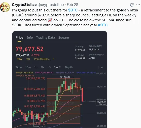
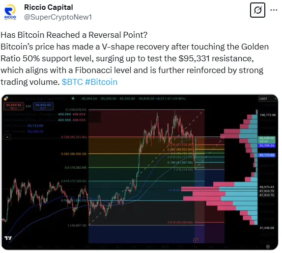
One of the prime uses of golden ratio levels is to anticipate trend reversals. A well-known concept is the “golden pocket,” which refers to the Fibonacci retracement zone between about 61.8% and 65% of a prior move. When an asset’s price retraces roughly two-thirds of its previous advance (landing in the golden pocket), many traders view it as a likely pivot point where the downtrend may end and an uptrend resumes.
In other words, a pullback into this golden ratio zone often denotes a complete price reversal level – the point at which the previous decline has likely exhausted and a new rally can begin. Traders often watch this area closely for confirmation signals (like a bounce or candlestick pattern) to time their entries, since historically it marks the beginning or end of significant trends.
Momentum shifts
Golden ratio indicators are also valuable for gauging momentum extremes. Fibonacci extension levels (projections beyond 100% of the original move, such as 161.8%) act as potential zones where a strong trend may weaken or reverse.
For example, if Bitcoin rockets upward, the 1.618 (161.8%) extension of a prior consolidation often emerges as a profit-taking zone – a level where the rally might stall or turn as buying momentum fades. In practice, analysts have found that golden ratio levels reliably correspond to both short-term pullbacks and major cycle turning points.
Historical analysis of Bitcoin shows that intraday or intracycle highs (temporary rally pauses) as well as major bull market peaks align with Fibonacci-based multiples of price moves.
Effectiveness: Research-backed insights and expert opinions
There is considerable market evidence backing the Golden Ratio Indicator’s effectiveness. In Bitcoin’s price history, many significant highs and lows have occurred at Fibonacci-derived levels. For instance, analyses of past market cycles found that Bitcoin’s intracycle rally tops and ultimate cycle peaks often coincided exactly with golden ratio multiples (like 1.6× or 2×) of key moving averages. This consistent alignment suggests that golden ratio-based markers are not random – they pinpoint structurally important levels in market psychology.
Expert endorsements
Seasoned traders and analysts frequently incorporate the golden ratio in their trading strategy. Dan McDermitt, a lead analyst at The Chart Guys, emphasizes tracking the “golden pocket” retracement during his Bitcoin analyses. He notes that when a price pullback holds in the 61.8%-65% zone, it “significantly increases the likelihood of sustaining a rally” thereafter.
Use with caution
Despite its power, experts caution that the Golden Ratio Indicator should not be used in isolation. Like any tool, it can produce false signals if market conditions stray from historical patterns. Over-reliance on a single Fibonacci level without additional confirmation can lead to traps (for example, assuming a bounce at 61.8% that doesn’t materialize).
Even Philip Swift (the developer of the Golden Ratio Multiplier model) advises using it as part of a broader strategy, not a standalone predictor. He and others recommend combining golden ratio levels with other indicators or price action analysis (such as volume trends, moving averages, or RSI) to validate the signal. In practice, this means if Bitcoin is approaching a golden ratio resistance, a trader might also check momentum indicators to see if the rally is indeed overextended.
Best channel to follow for Golden Ratio trading
The Secret Mindset: This channel covers Fibonacci trading strategies suitable for both beginners and experienced traders:
- Example Video: Fibonacci Trading Strategy Course Makes $1K/Week
Top Dog Trading: This channel offers practical trading strategies utilizing Fibonacci retracements in various markets:
- Example Video: The 5-Minute Fibonacci Trading Strategy That Actually Works
Final trading tip
The Golden Ratio Indicator can dramatically improve your trade timing, but always use it alongside other evidence for optimal results. In practice, this means waiting for confirmation at golden ratio levels rather than acting blindly.
💡 For instance, if a coin’s price dips to the 61.8% support, watch for a bullish reversal candlestick or a volume uptick to confirm the bounce before buying in – this filters out false signals.
Conversely, if you’re riding an uptrend, consider taking partial profits near the 1.618× extension of your starting price (a common golden ratio target). Many successful traders lock in gains incrementally at these Fibonacci extension levels, as historically they’ve been reliable points where trends pause or reverse.
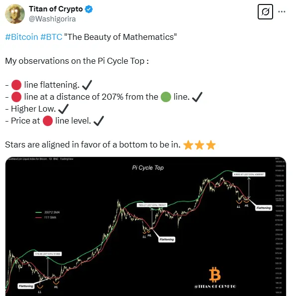
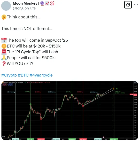
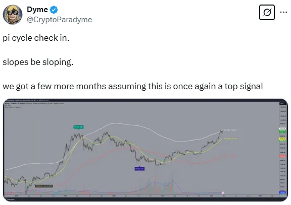
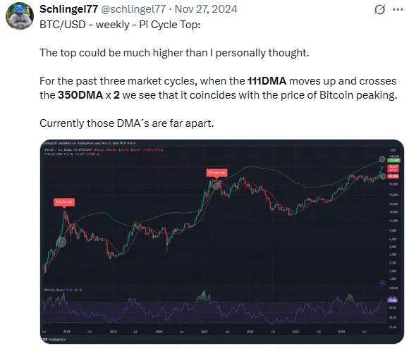
Pi Cycle Ratio
The Pi Cycle Ratio identifies potential cycle tops and bottoms by analyzing moving averages.
Origins of Pi Cycle ratio
The Pi Cycle Ratio originates from the Pi Cycle Top Indicator, which was developed by Philip Swift, a well-known crypto analyst and the creator of LookIntoBitcoin. The indicator was designed to predict Bitcoin’s market cycle tops with high accuracy using a mathematical relationship between moving averages.
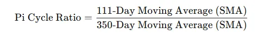
The concept is based on the 111-day and 350-day Simple Moving Averages (SMAs), with the 350-day SMA multiplied by π (3.141) in the original Pi Cycle Top formula. Over time, analysts refined the Pi Cycle Ratio, simplifying it to the ratio of the 111-day Simple Moving Average (SMA) divided by the 350-day Simple Moving Average (SMA).
What is the Pi Cycle ratio?
The Pi Cycle Ratio compares two specially chosen moving averages of Bitcoin’s price, whose ratio is about π (3.14), to signal major cycle turning points.
Its formula is:
By identifying these extreme tops (and even bottoms), the Pi Cycle Ratio helps traders and investors analyze Bitcoin’s market cycles, signaling when the market may be overheating or recovering.
How it works (identifying tops & bottoms)
Pi Cycle top
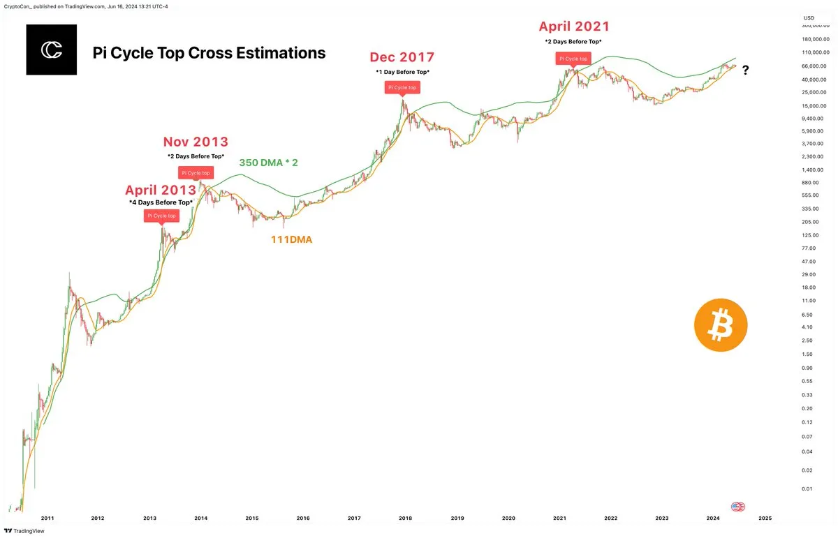
The original Pi Cycle indicator uses the 111-day moving average (111DMA) and a 350-day moving average doubled (350DMA x2). When the short-term 111DMA shoots up and crosses above the 350DMA×2, Bitcoin has historically been at a market cycle peak (a major top).
This cross marked the end of bull runs in past cycles – for example, it signaled the 2013, 2017, and April 2021 tops within ~3 days of the actual price high.
The math behind it is what gives the indicator its name: 350/111 ≈ 3.153 (very close to π), hinting at Bitcoin’s cyclical rhythm.
Pi Cycle bottom
A later adaptation of this indicator also tackles market bottoms. Researchers found a pair of averages with a π relation that fit past bear-market lows: a 150-day exponential MA and a 471-day simple MA (since 471/150 ≈ 3.14). When the 150-day EMA dives below a fraction of the 471-day SMA, it has coincided with Bitcoin’s bottoming out.
Notably, the 2015 and 2018 bear market lows were signaled when these moving averages crossed, with the actual price bottom occurring within just a few days of the cross. In other words, a Pi Cycle bottom signal has historically marked the end of a bear market and the start of a recovery.
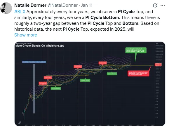
Short-term vs. long-term use
Long-term (macro) strategy
The Pi Cycle Ratio is primarily a long-range tool geared toward cycle investors. Because it triggers only at major peaks and troughs (just a handful of times in Bitcoin’s history), it’s most useful for long-term decision-making. Investors and swing traders can use a Pi Cycle top flash as a warning that Bitcoin has entered “unsustainable” price territory, meaning a trend reversal downward is likely near.
Historically, selling or taking profit when this indicator flashed yielded favorable results, as prices soon began multi-month declines. Similarly, a Pi Cycle bottom signal can encourage long-term buyers to start accumulating, as it suggests the market may be transitioning from a bear phase into a new bull cycle.
Short-term trading
In contrast, short-term traders (day traders or week-to-week traders) will find the Pi Cycle Ratio too slow and infrequent for timing daily moves. It does not generate frequent signals – sometimes entire years pass between a bottom and top signal.
Thus, it won’t help with minor price swings or intraday entries/exits. However, even short-term-focused traders keep an eye on it as a background indicator. If the Pi Cycle Ratio is nearing a known extreme (for example, the lines are close to a crossover), a day trader might become cautious on bullish positions, knowing that a macro top signal could soon introduce large volatility or a trend change.
Trend reversal signals
Yes – the Pi Cycle Ratio is essentially built to signal major trend reversals in Bitcoin. A Pi Cycle top signal has consistently coincided with the culmination of a bull market – right when euphoria and price acceleration hit an extreme and a downtrend follows. Each time the 111DMA crossed above the 350DMA×2 in past cycles, Bitcoin’s uptrend flipped to a sharp downtrend shortly thereafter.
In that sense, the indicator provided an early heads-up to exit before the bullish trend reversed into a bear market. On the flip side, the Pi Cycle bottom indicator aims to catch the moment a prolonged downtrend is exhausted and about to turn upward. When the 150-day and 471-day moving averages intersected at cycle lows, Bitcoin soon stopped falling and began a new uptrend.
Traders view such a bottom cross as a sign that bearish momentum is likely ending (a potential trend reversal to the upside). It’s worth noting that outside of these major turning points, the Pi Cycle Ratio stays silent – it doesn’t fire off signals for minor corrections or rallies. Its value lies in calling the big reversals (the end of multi-year bull or bear phases), rather than the many smaller trends within those phases.
Effectiveness and expert insights
By all accounts, the Pi Cycle Ratio’s historical performance for Bitcoin has been extraordinary. It has accurately identified the last three major Bitcoin tops (2013, 2017, 2021) with only a few days’ margin of error. This kind of precision – calling multi-year peaks almost to the day – is why many analysts rank it among the best Bitcoin indicators. Its recent application to bottoms also flashed signals near the 2015 and 2018 bear lows, further building confidence in its cycle timing ability. Few other indicators have consistently nailed these inflection points so closely.
Why it works
Experts note that Bitcoin’s price history has followed regular boom-bust cycles during its first decade, partly due to recurring hype cycles and halving-driven supply shocks. The Pi Cycle Ratio capitalizes on this by capturing the point of extreme overextension (i.e., when shorter-term price growth far outpaces the longer-term trend). This typically marks the final blow-off phase of a bull run.
Many on-chain analysts include the Pi Cycle metric (or similar MA-ratio metrics) in their toolkits to judge if conditions are overbought or oversold, using it to improve the timing of big moves.
Expert opinions & caution
Despite its strong track record, savvy analysts caution traders not to rely on it blindly going forward. One concern is that the Pi Cycle settings were retroactively optimized to fit past data. The developers adjusted moving average lengths (and multipliers) specifically to match previous tops and bottoms – a process that risks curve fitting (i.e., tweaking a strategy so it perfectly fits past data but may not work in future market conditions because it’s over-optimized for historical patterns).
As a result, if Bitcoin’s cycle patterns change, the same formula might not hold. In fact, analyst Benjamin Cowen observes that the Pi Cycle top crosses have been diminishing in intensity each cycle – the 2021 crossover was much weaker and shorter-lived than prior ones. This could indicate that as Bitcoin’s market matures (with more institutional involvement and different dynamics), the once-reliable Pi signal might not always appear, or might not coincide exactly with the next peak.
Even Nasdaq notes that while the indicator proved its worth in Bitcoin’s first 15 years, its effectiveness may diminish as the market evolves and cycles become less predictable.
Use in confluence
Most experts therefore treat Pi Cycle Ratio as a valuable component of analysis rather than a standalone oracle. The recommended approach is to combine it with other indicators and research to validate its signals.
For example, if Pi Cycle flashes a top, one might also check on-chain metrics (like MVRV-Z or exchange flows) and technical signs (like weakening momentum or a break of support) for confirmation.
Crypto market commentators often stress that no single metric can account for all factors; by using Pi Cycle alongside trend analysis, volume, and even fundamental news, traders can gain higher confidence in their decisions.
Best channel to follow for Pi cycle updates
For traders interested in tracking the Pi Cycle Ratio and Bitcoin market trends, a great resource is Benjamin Cowen’s “Into The Cryptoverse” channel on YouTube. Cowen is known for his data-driven approach to crypto cycles and frequently discusses long-term indicators like the Pi Cycle Top in his analysis. In one recent episode, for instance, he dove deep into how the Pi Cycle indicator works, its past performance, and whether it can be trusted for future peaks. Alternate choice: the LookIntoBitcoin website by Pi Cycle’s creator, Philip Swift, offers free charts and updates.
Final trading tip
Leverage the Pi Cycle Ratio as a compass, not a crutch. Use its signals to inform your strategy – for example, if the Pi Cycle Ratio is flashing a top, treat it as a strong warning to secure profits or tighten stop-losses rather than chasing further upside. However, always **cross-verify with other indicators (**like RSI, MACD, and on-chain metrics [MVRV Ratio]) and market factors (macroeconomic trends, Bitcoin halving cycles, and institutional activity) before acting on Pi Cycle alone.
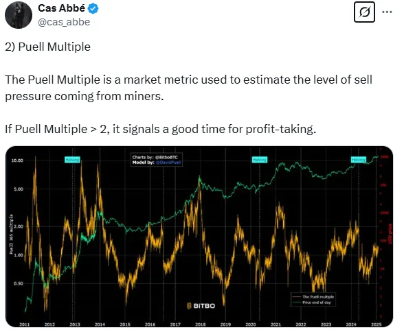
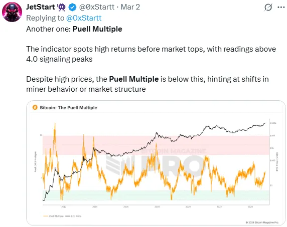
Puell Multiple
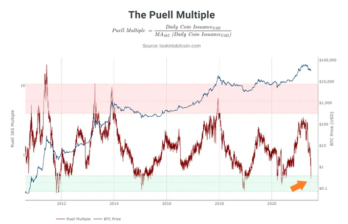
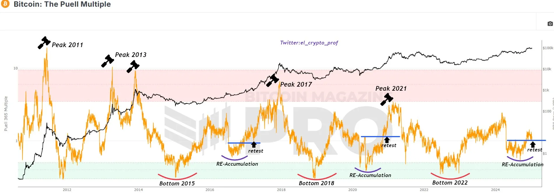
The Puell Multiple is an on-chain metric that measures Bitcoin miners’ daily revenue relative to its historical average.
Origins of the Puell Multiple
The Puell Ratio was developed by David Puell, an on-chain analyst known for his work in Bitcoin market analytics. It is an on-chain metric designed to assess the profitability of miners and identify potential market cycle tops and bottoms.
The formula for the Puell Ratio is:

What is the Puell Multiple?
Because miners are the “supply side” of Bitcoin (they regularly sell earned BTC to cover costs like electricity and hardware), the Puell Multiple provides insight into miner profitability and selling pressure . In essence, it estimates how healthy or stressed miner revenues are on any given day and thus how much sell pressure miners might exert on the market. This focus on miners’ economics offers a unique, supply-side perspective on Bitcoin’s market cycles, complementing traditional demand-side or price-only indicators.
How it works: Identifying overvaluation vs. undervaluation
By comparing current miner revenue to the yearly average, the Puell Multiple acts as an oscillator that swings high or low with market extremes. High values indicate that miners’ daily income is far above its 1-year norm, meaning Bitcoin’s price (and thus mining revenue) is unsustainably high relative to recent history. Historically, when the Puell Multiple enters the upper “red zone” (commonly defined as values above ~3–4), Bitcoin’s price has been at cycle peaks, suggesting the market is likely overvalued. These red-zone occurrences have aligned with major tops, offering miners huge profits and often preceding market corrections as miners increase selling.
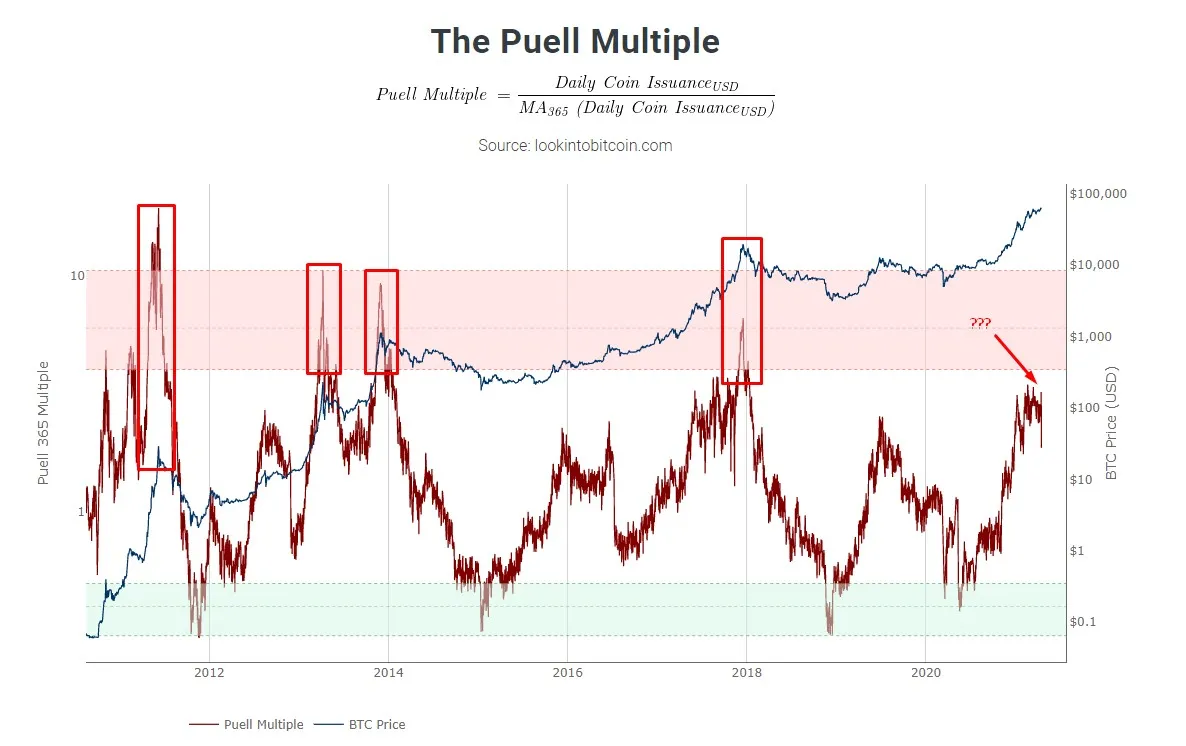
Conversely, low Puell Multiple values signal that miners’ income is well below the yearly average, implying weak profitability. When the indicator falls into the lower “green zone” (around 0.5 or below), it has marked periods of extreme undervaluation for Bitcoin. These instances typically coincide with bear market bottoms or oversold conditions, when BTC’s price is so low that many miners struggle to break even. At such low profitability, some miners shut off rigs (reducing supply pressure), and those who remain operational tend to hold rather than sell, since selling at a loss makes little sense. Historically, the green zone has offered prime buying opportunities – past dips into this zone preceded significant price rebounds and marked ideal times to accumulate Bitcoin.
Short-term vs. long-term trading use
The Puell Multiple is especially prized by long-term investors and cycle analysts for its ability to map out macro highs and lows. Its infrequent extreme signals align with major market cycle turning points, which is ideal for a long-term strategy (e.g. identifying multi-year peaks to take profit, or deep bottoms to accumulate). Long-horizon traders use the red and green zones to strategically time their entries and exits in the market, viewing the Puell Multiple as a guide to Bitcoin’s broader boom-and-bust cycles.
That said, the Puell Multiple can also offer insights to shorter-term traders. By tracking the metric’s trend and relative level, traders can gauge shifts in miner behavior that sometimes precede price moves.
For example, a rising Puell Multiple means miner revenues are improving relative to the annual average, indicating the market is “heating up” and miners face less pressure to sell. This often correlates with bullish momentum in the near term. A falling or very low Puell, on the other hand, suggests miners are under stress (revenues dropping), which can foreshadow miners capitulating or a cooldown in the market.
In fact, understanding miner selling pressure via Puell can reveal short-term trend changes before they become obvious in price charts, as one source notes: miners with large BTC treasuries will sell more aggressively when under revenue stress, potentially pushing prices down, and vice versa.
However, it’s important to note that the Puell Multiple is not a high-frequency trading signal – its greatest value is in identifying macro-level overbought or oversold conditions rather than day-to-day fluctuations. Short-term traders might use it to inform their market bias or to validate other technical signals, but they typically combine it with faster indicators for timing exact trade entries/exits.
Does it signal trend reversals?
Yes – at extreme readings, the Puell Multiple has a strong track record of signaling major trend reversals in Bitcoin. When the indicator flashes a red-zone value (indicating extreme miner profitability), it often marks a turn from bull market to bear. Miners selling at peak profits increases supply on the market, which has historically led to sharp corrections or the end of exuberant rallies.
In previous cycles, Bitcoin’s price tended to reverse downward shortly after Puell Multiple spiked into its top band, confirming those levels as blow-off tops or distribution phases. Similarly, when Puell plunges into the green zone, it has signaled an impending upward reversal. These low points correspond with miner capitulation and maximum pain, which paradoxically set the stage for a rebound as selling pressure abates.
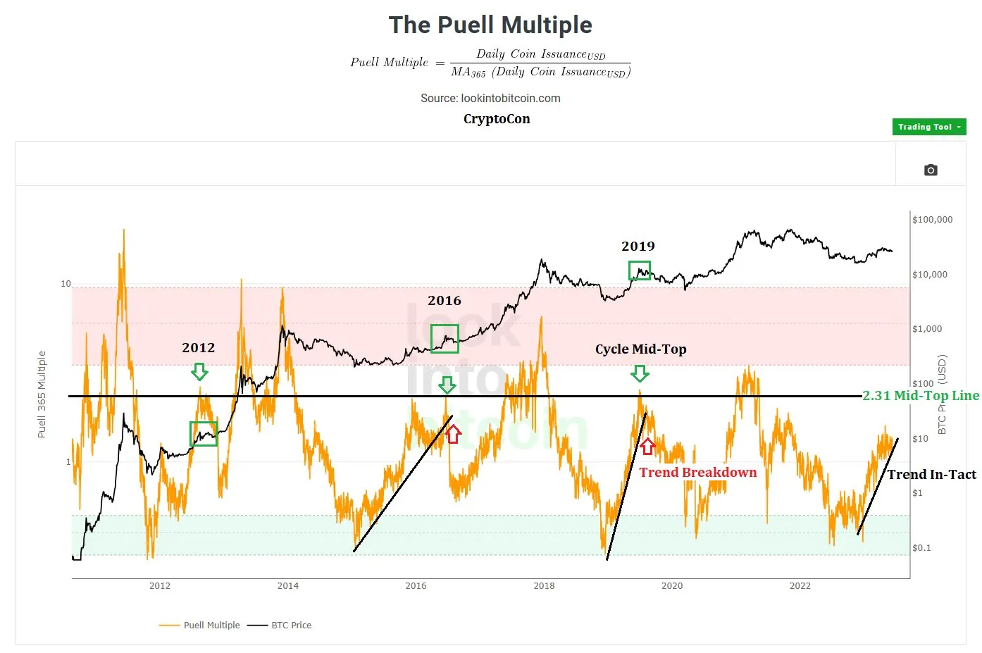
Analysts note that a Puell reading under ~0.5 – indicating miners at a loss – is “a strong indicator” that the market is poised for a bullish reversal. Essentially, the Puell Multiple’s red and green thresholds serve as early warning signs of trend exhaustion. While it may not pinpoint the exact day of a reversal, it consistently identifies the zones where the prevailing trend is likely running out of steam (uptrend overheating or downtrend bottoming out).
Effectiveness and expert opinions
Unlike many technical indicators that focus purely on price or momentum, Puell brings in fundamental data (miner revenues), which adds depth to market analysis.
Glassnode, a leading on-chain data firm, notes that Puell examines the fundamentals of mining profitability and how they shape market cycles. By focusing on miners’ incentive to sell or hold, it captures an aspect of market behavior that other indicators might miss. Many experts view this metric as a powerful tool.
For instance, Bitcoin Magazine calls it a “unique perspective on Bitcoin’s market cycles” because it concentrates on the supply side dynamics rather than just demand. Its ability to consistently flag overvalued vs. undervalued conditions (often ahead of price reversals) has earned it a top spot among on-chain indicators.
In fact, the Puell Multiple is frequently mentioned alongside other revered metrics like the MVRV Z-Score, RHODL Ratio, and Reserve Risk, all of which identify unsustainable price extremes. The consensus in the crypto research community is that the Puell Multiple adds significant value to a trader’s toolkit – it’s “a crucial tool for assessing Bitcoin’s valuation relative to mining rewards.”
Recommended channel for Puell Multiple & bitcoin trading insights
For a comprehensive understanding of the Puell Multiple, the Glassnode Academy YouTube channel offers an insightful video titled “The Puell Multiple,” which delves into the metric's significance and application in Bitcoin analysis.
Additionally, the Look Into Bitcoin channel provides a video titled “The Puell Multiple,” offering another perspective on this indicator.
💡 For broader Bitcoin analysis, MC² Finance channel features this indicator on its dashboard so that traders can quickly assess miner revenue trends and potential market turning points.
Final trading tip: Maximizing strategy with Puell Multiple
Incorporate the Puell Multiple as a compass for your Bitcoin strategy, especially at extreme readings.
For example, when the Puell Multiple enters a historically high red zone, consider locking in profits gradually instead of waiting for a perfect top – one analysis suggests starting to trim positions once Puell exceeds about 2 and exiting more fully above 3. Likewise, when it dips into the deep green zone (indicative of heavy undervaluation), it may be a good time to incrementally accumulate Bitcoin on the expectation of an eventual rebound.
Always combine Puell Multiple insights with other indicators and risk management practices. This means using it alongside technical analysis (like RSI or moving averages) and other on-chain metrics to confirm signals. By doing so, you’ll avoid trading on any single metric in isolation.
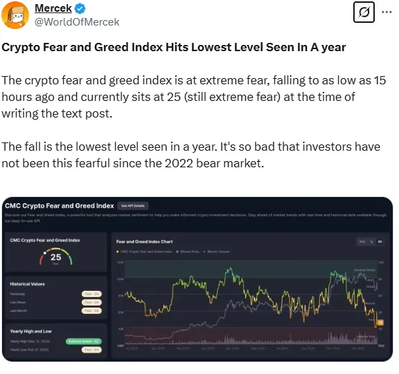
Crypto Fear & Greed Index
The Crypto Fear & Greed Index is a popular tool that gauges the emotional sentiment of the cryptocurrency market on a scale from 0 to 100.
Origins of the Crypto Fear and Greed Index
The Crypto Fear and Greed Index was created by Alternative.me as a sentiment analysis tool designed to measure the emotional state of the cryptocurrency market. The index was inspired by the traditional Fear and Greed Index used in stock markets, which gauges investor sentiment based on various market indicators. Recognizing the highly volatile and sentiment-driven nature of cryptocurrencies, Alternative.me adapted the concept to track Bitcoin and the broader crypto market by aggregating multiple data points, including volatility, market momentum, social media trends, dominance, and Google search trends.
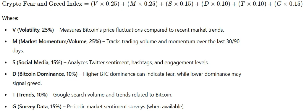
Crypto Fear and Greed formula
The Crypto Fear and Greed Index does not have a strict mathematical formula but is instead calculated using a weighted combination of several market factors. The index is scored on a scale from 0 to 100, where 0 represents extreme fear and 100 represents extreme greed.
How the Index works: Data inputs and identifying tops/bottoms
The Fear & Greed Index is calculated by combining several market metrics each day to produce a single sentiment score. Key components include:
- Volatility (25%) – sudden price swings or high volatility (especially versus 30-day/90-day averages) indicate fear. An unusual spike in volatility suggests a fearful market.
- Market momentum/Volume (25%) – high trading volumes and strong momentum to the upside signal greed, while low volumes or momentum drop indicate fear.
- Social media (15%) – surging engagement on crypto topics (e.g. a jump in Bitcoin Twitter mentions) reflects growing public interest and can indicate rising greed. (Reddit sentiment is tracked too, though those surveys are currently paused.)
- Surveys (15%) – previously, weekly polls gauged investor sentiment; a very bullish consensus meant greed, and very bearish meant fear (surveys are paused for now).
- Dominance (10%) – looks at Bitcoin’s share of the total crypto market cap. When BTC dominance rises, it implies investors retreat to the “safety” of Bitcoin (sign of fear). When BTC dominance falls, investors are buying riskier altcoins (sign of greed).
- Google trends (10%) – tracks search trends for terms like “Buy Bitcoin” or “Bitcoin sell-off.” A spike in “how to buy bitcoin” searches aligns with growing greed, whereas a surge in “sell bitcoin” queries suggests rising fear.
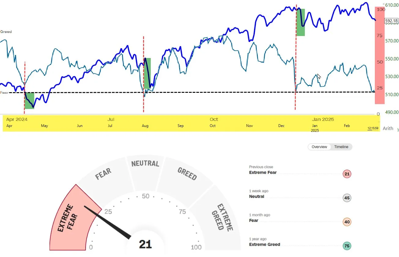
By aggregating these factors (updated daily), the index provides a composite sentiment score. Traders often watch extreme readings closely. Historically, extremely low scores (Extreme Fear, say < 20) tend to coincide with market bottoms or oversold conditions, while extremely high scores (Extreme Greed, say > 80) often occur near market tops or overheated conditions. The idea is that when sentiment is maxed out in one direction, the market may be poised for a reversal.
For example, when the index is 0-24 (extreme fear), the market is overwhelmingly bearish and “there aren’t that many people left to sell,” which could represent a buying opportunity. Conversely, when the index hits 75-100 (extreme greed), it implies most investors are bullish and nearly fully invested (few buyers left), which might precede a downside reversal or correction.
Short-term vs. long-term use in trading
The Fear & Greed Index is generally considered more effective as a short-term sentiment indicator rather than a long-term timing tool. Because it’s based on real-time data and updated daily, it excels at capturing immediate market sentiment shifts – useful for short-term traders or swing traders trying to gauge the week’s mood.
For instance, a day trader might check if sentiment has suddenly swung to fear (which could mean an oversold bounce is likely) or to greed (potentially time to tighten stop-losses).
Short-term traders can use these sentiment extremes to fine-tune entry and exit points in conjunction with technical analysis. For long-term investors, the index is less about precise timing and more about context. Prolonged periods of extreme fear might signal a deeply undervalued market or a late-stage bear market where long-term buys could be favorable. Similarly, sustained extreme greed could hint that a bull market is overheated.
However, the index does not predict long-term trends or bull/bear cycles on its own. Long-term holders should not make drastic portfolio shifts based solely on this daily sentiment meter. Instead, they might use it to avoid emotional reactions – e.g. not panic-selling during a fearful dip if they believe in the long-term value, or not chasing hype during greedy peaks.
Does it signal trend reversals?
While not a traditional technical indicator, the Fear & Greed Index often coincides with potential trend reversal points when it reaches extremes. Many traders view extreme high or low readings as a contrarian signal that the current trend may soon exhaust itself.
For example, an extremely high greed reading can warn that bullish momentum is overextended and a bearish reversal (or at least a pullback) could be imminent. Conversely, extreme fear suggests capitulation and pessimism are rampant, often occurring near the end of a downtrend before a bullish reversal or relief rally.
This aligns with the famous investing adage by Warren Buffett: “Be fearful when others are greedy, and greedy when others are fearful.” In practice, the index encapsulates that idea – when it hits greed extremes, a savvy trader grows cautious or “fearful” of an impending downturn; when it shows extreme fear, a trader becomes “greedy” by looking for buy opportunities.
However, the index is not a precise timing tool and doesn’t issue explicit “buy” or “sell” signals like a coded technical indicator would. It highlights conditions that could lead to reversals, but it’s up to the trader to confirm with other evidence.
For instance, the index might sit in extreme fear for an extended period during a prolonged crash – entering too early just because it’s low can be painful if prices still fall further. Likewise, markets can stay greedy and keep rising longer than one might expect.
Thus, while a rapidly changing or extreme sentiment reading often precedes a trend change, traders should use the Fear & Greed Index alongside other indicators (price patterns, volume, RSI, etc.) to validate a true reversal signal.
Expert insights and effectiveness of the Index
Research and expert opinions generally affirm the Fear & Greed Index’s value as a sentiment gauge, while advising it be used with caution. A 2024 study using machine learning found that the Fear & Greed Index strongly correlates with Bitcoin’s price movements, underscoring that market sentiment (as measured by the index) closely tracks crypto valuations. However, the same research and many analysts note that correlation is not perfect; crypto prices are volatile and driven by many factors, so sentiment alone won’t predict exact outcomes.
💡 For example, during a market slump an analyst might point out the index is deep in “Extreme Fear” territory as evidence of widespread pessimism (potentially a contrarian buy signal).
The consensus among trading experts is that the Fear & Greed Index is best used as one tool among many. It provides unique insight into the psychological state of the market, which technical and fundamental indicators might miss, but it should be combined with other analysis for robust decision-making.
Notably, the Fear & Greed Index concept originated in stock markets (developed by CNN Money for equities) and was later adapted to crypto. This cross-market usage lends it credibility. Even veteran investors like Buffett (quoted above) and others acknowledge the power of crowd sentiment in driving markets – which is exactly what this index quantifies.
Best channel to follow for Fear & Greed updates and crypto trading
For deeper analysis and trading commentary, consider following reputable crypto YouTube channels that often discuss sentiment indicators. One example is InvestAnswers (run by crypto analyst James Mullarney). He frequently covers the Fear & Greed Index in his market updates.
Another well-regarded channel is Coin Bureau, which occasionally touches on the Fear & Greed Index and other sentiment measures in its market explainers.
💡 Following the Index on MC² Finance (and subscribing to its whale alerts) is however the perfect interactive experience.
Final trading tip: Using Fear & Greed to enhance your strategy
Use the Fear & Greed Index as a contrarian compass to fine-tune your trading strategy, but always pair it with other analysis. When the index shows extreme fear, it usually means most traders are very bearish – this could be an opportunity to scan for oversold assets and prepare to “be greedy when others are fearful” (i.e. consider buying). When the index shows extreme greed, it means euphoria is high – a wise trader might get “fearful” when others are greedy, by tightening stop-losses, taking some profits off the table, or at least not chasing the rally blindly.
Final thoughts
While market-wide indicators (i.e., Golden Ratio Indicator, Pi Cycle Ratio, Puell Multiple, Fear & Greed Index) help gauge overall sentiment, trend and momentum indicators — like RSI, MACD, EMA, SMA, and Bollinger Bands — provide deeper insights into price movements.
That’s why MC² Finance goes further:
✅ Authenticity score: Helps you filter out unreliable tokens.
✅ Hype score: Tracks market excitement for smarter decision-making.
📍 Check them all now on mc2.fi and trade with confidence! 🚀